Light fastness tests
Depending on personal perspective, a drawback to working with plants is their sensitivity to light.
Being from a living organic origin, the compounds found in plants that appear as colours, can be fairly impermanent when exposed to high levels of light. It's a question we get asked regularly and is definitely something that is a significant aspect of working with these materials.
Personally I really like the transient changeable qualities of such colours and often describe them as ‘living colours’. I view it as something to be celebrated and embraced and not to be too concerned about. It is a reminder of the constant state of the impermanent change of all things. I also love the fact that the colours are animate, dynamic and responding to their environment, so much more interesting than inert factory produced pigments.
Very few plant colours will disappear all together and usually it's a case of them fading and losing some of the initial brightness of when they are first applied to paper. This to my eye can often enhance their beauty and offers a refreshing unpredictability as to how the changes will develop over time.
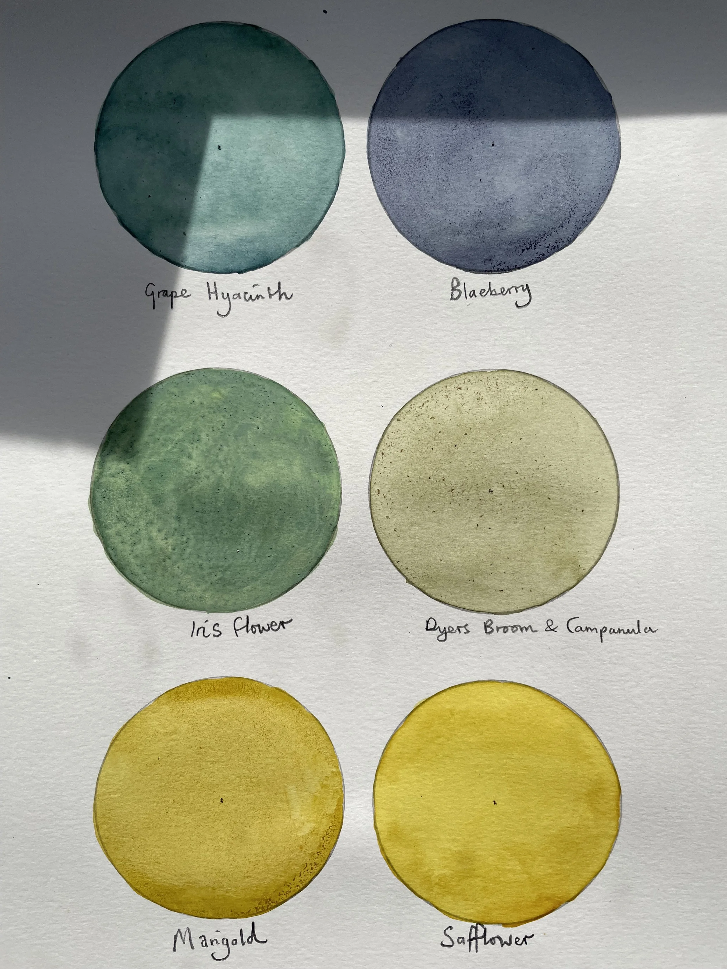
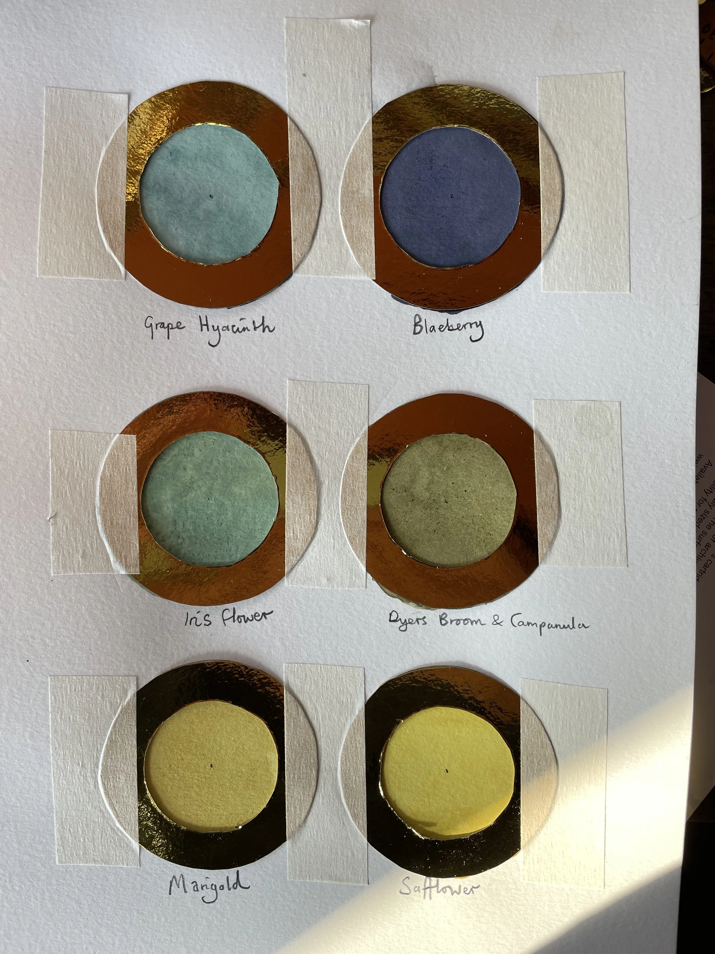
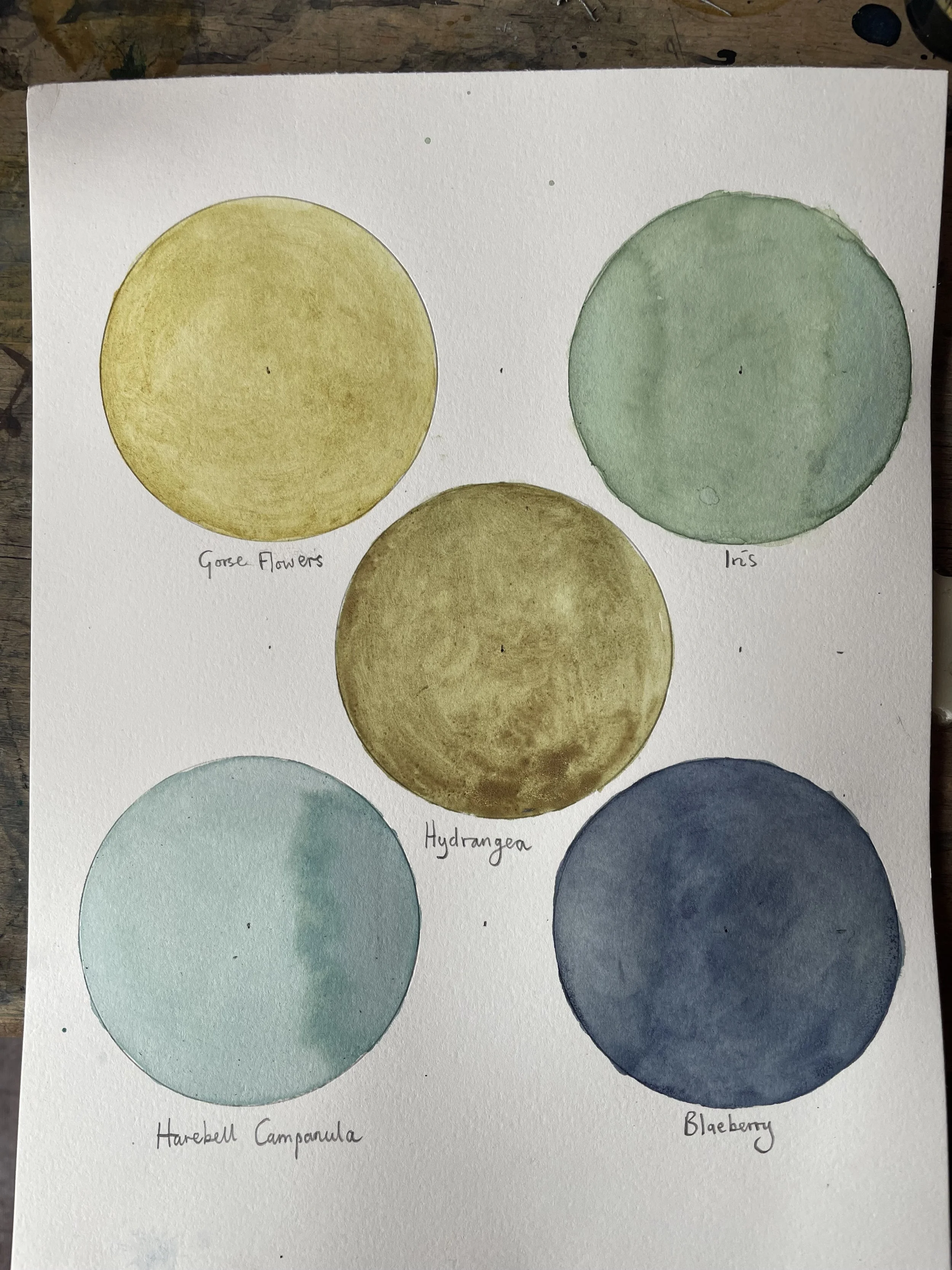
Something else to have in mind is that not all colours are ‘fugitive’ and some will even darken in certain conditions. Inks from trees tend to be very light fast due to the high amounts of tannins present and other examples of light fast plant colours include goldenrod, walnut and madder root.
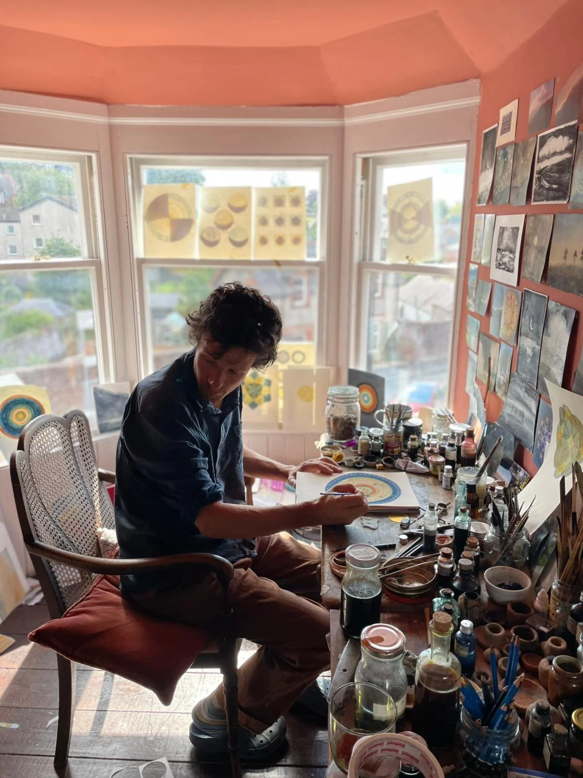
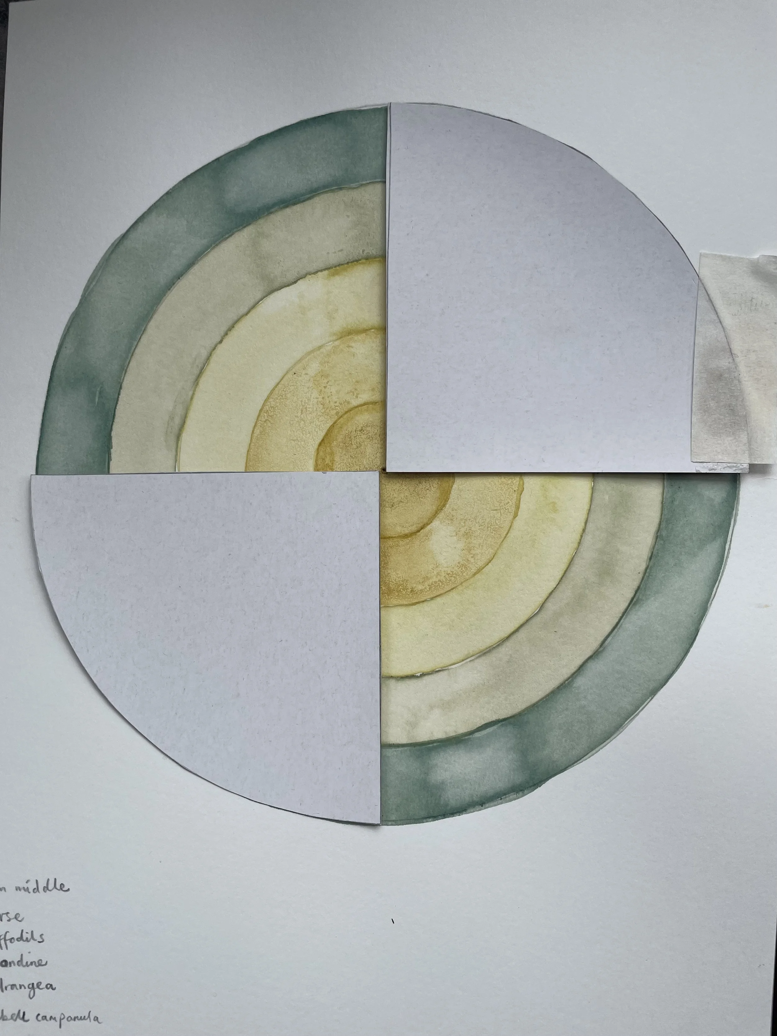
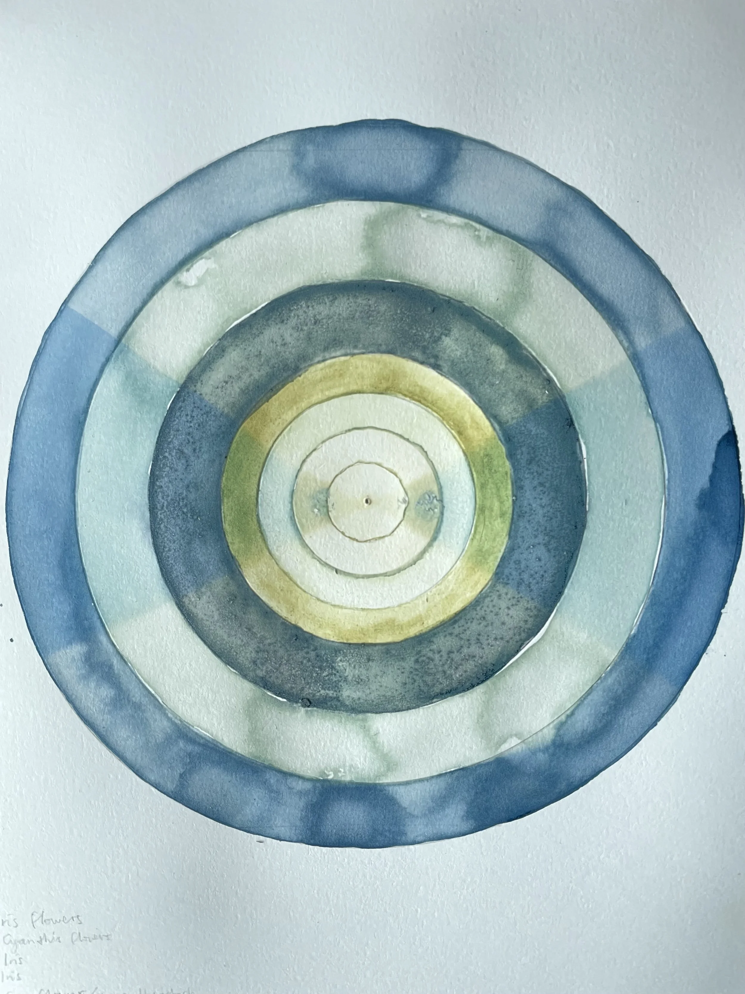
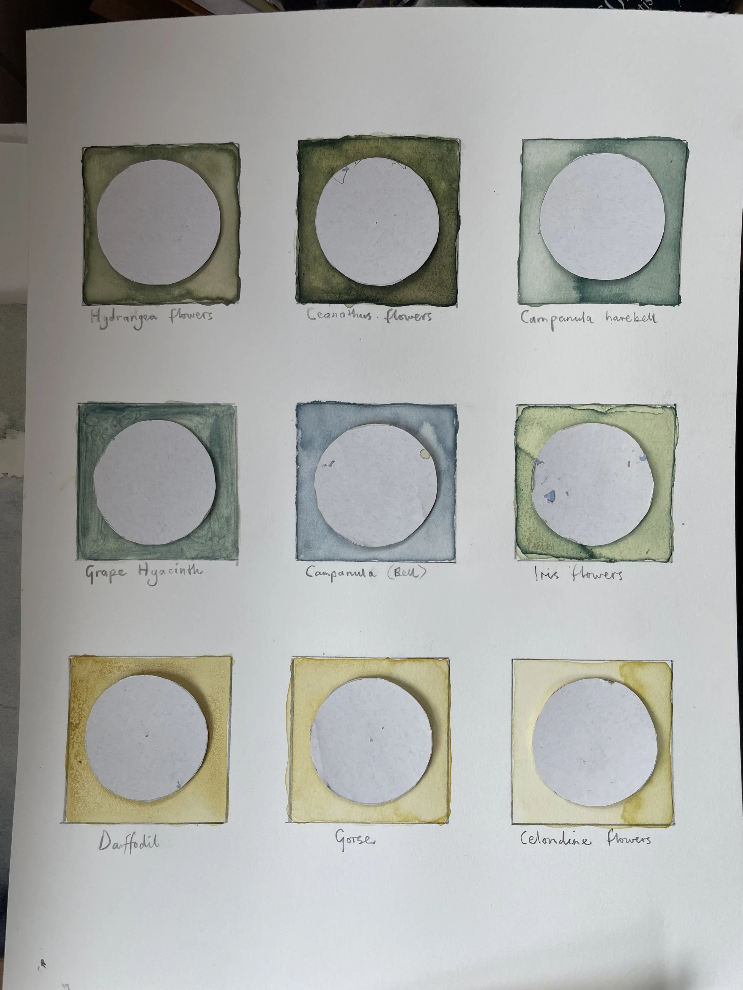
A way of testing and seeing fairly quickly how plant colour might respond to light is to conduct homemade tests, by exposing inks made from the plants, to as much light as possible. This is of course any south facing window at this time of the year. Usually artwork of any kind isn't displayed to prolonged amounts of direct sunlight such as this but by doing so it's possible to see light's effect sped up.
Some of the plants I chose, I knew to be very sensitive but I wanted to see this for myself. For example, it quickly became clear that blaeberries fade very quickly. Some of the other plant inks I displayed include gorse flowers, a few different campanulas, safflower and grape hyacinth.
The images below show the effects after a few weeks and up to month of being in the window on the various colours I was experimenting with. The results are intended to be shown to our autumn workshop to demonstrate to participants this intriguing quality of paint and inks made in this way, and to invite discussions on the subject.
Edward